
I’ve been wanting to aggregate my thoughts on texture use in Second Life architecture, and will do my best to keep it concise without being totally devoid of information. I view texture work as critical to a great build. They complete your structures and objects in way that sheer prim structure cannot. They add visual depth and emotional overtones. They transform a flat space into an immersive environment.
Size Matters
In an ideal world, we would all have 1Gb video cards and 100Gb bandwidth connectivity to the Internet. We don’t live in that world, so a smart designer has to find a balance between quality aesthetics and user accessibility. In other words, reduce lag as best you can. One area where we have the power to defeat lag is texture resolution.
The goal is to use the smallest possible texture sizes you can get away with. A good rule of thumb is to have 75-80% of your textures saved at 256 pixels by 256 pixels or smaller, and the remaining textures at 512x512 pixels. I almost never have more than one, maybe two, textures at 1024x1024 in an entire build, and that’s usually only if I’m sharing one texture across several prims. If you want proof of a great looking build with low-res textures, check out Midnight City.
 Almost every texture there is 256x256 or less.
Some of the free textures you can get on the web are saved at 512x512. If it’s a background texture, and one you are going to be tiling (repeating) multiple times across a prim, it’s worth saving and using a version at 256x256. My exception to this rule is when I am tiling a texture 1x1 on a very large prim, and want to keep the texture more “in focus”.
Every Side is Important
This one is simple: pay attention to how your textures are situated on EVERY side of your prims. Too often you see a long but thin prim where the builder has repeated the texture properly on the long side but left it squashed into an abstract smear on the thin sides.
If you take a look at the below picture, you can see that sides 1 and 2 have properly positioned textures, but side 3 is squashed.
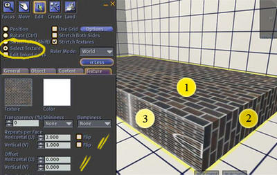 You can fix this by going into Edit mode, clicking the “Select Texture” radio button and customizing your sides. (Extra note: by holding down the shift key, you can select multiple textures sides at once). For Side 1, we have repeated the texture 2 x 1 (once on the short side, twice lengthwise). Essentially we are repeating the texture once every meter. Since our thin sides are only 0.2 meters thick, we need to “repeat” our texture on that side one-fifth as much, or 0.2. The texture on that side would thus be repeated 2x horizontally and 0.2x vertically.
When working with textures like a brick or stone block wall, you will also want to play with rotation (for example, side 1 and side 2 are rotated perpendicular from each other -- one is set to zero rotation, and one to 90 degree rotation). Also experiment with “flipping” your texture and offsetting how the texture is positioned on the prim side. Understanding these tools will help you properly align textures on multiple prims, and textures on the various sides of one prim.
If I going to use a prim more than once, I will create a master prim and get the textures positioned and repeated properly. Only then do I copy the prim.
Lighting
A little bit of lighting goes a long way. While you can’t create perfect shadows on every surface,
 with smart prim and texture work you can add a lot of ambiance. I constantly learn a huge amount about this just by watching Aimee Weber work (see picture).
One technique is to create a texture that will be repeated 1x1 on your prim, and “bake” the lighting/shading directly onto the image. For photoshop users who want to create a general light-cast on their image, one tool to get familiar with is Filter -> Render -> Lighting Effects. If you know how your shadow-casting objects are going to be positioned and the position of your light-source, you can also hand-draw shadows (make sure they are appropriately semi-transparent and blurry). Another technique is to take a picture of just the object itself and use that image (with the background removed) to create a shadow layer on top of your base texture. This may require playing with transparency, hue/saturation, blurriness, and rotation/skew in order to get the right feel. There are also 3D software tools that can make this easier.
If you don’t want to bake a single texture, you can place the shadow on its own prim. The tree shadows I give away for free are an example of this. It has to sit on its own prim because I have it rotate slightly to mimic movement of a tree in wind. I don’t want the ground underneath rotating as well – just the shadow!
Asymmetrical Textures
I recently learned some new things about how the SL engine handles textures, which is especially useful if you are working with an image whose dimensions do not naturally fit into a power of 2 (i.e. 2, 4, 8… 256, 512, etc). Rather than rehashing it here, I want to draw people’s attention to Chosen Few’s answer in this forum post. I’d also like to take this opportunity to thank Chosen for investing so much time and energy into helping new players learn about textures and building within SL.

Great post and very helpful screenshots to go along with it, Forseti. I remember Loki Piko back in the day teaching me how to change just one side of a prim's texture, and it was like the light shone upon me from heaven above. Nice work!
ReplyDelete