Friday, September 30, 2005

Looking Forward and Backward in SL


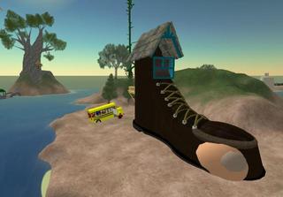
That right there is a piece of SL nostalgia folks. Pete Fats' boot in Welsh. I managed to get Steller Sunshine's (SL's 1st resident) massive bean stalk in the background as well.

A thread in the forums go me thinking about SL nostalgia. I love old things, not just SL old things, but all kinds. I appreciate the history behind objects and places. I like to learn about how things got there, and why. In Second Life, where change is constant, old things that have been around for a while are even more scarce and therefore precious. I've been eager to learn about these "virtual antiques" and have often pestered people like Steller Sunshine, Khamon Fate, Buck Weaver and Jai Nomad about stuff on the grid that seems to have been in existence forever. More than once I have been way off base in my assumptions about these things, which makes it all the more fun to learn about them. Nothing just happens in Second Life on it's own. Someone, at some point, decided they would do something and what gets left around on the grid is evidence people's ideas and thoughts at the time they were placed there. Fascinating!

Despite my love for all things old, I enjoy the changes that happen in SL. Stagnation is never any fun, which is why I get excited about new builds, new projects, new people and I find it difficult to get overly worked up about a new policy change, or change in the system that LL implements. Second Life, in my opinion is still very much in a sort of beta stage. Linden Labs still has a lot more experimenting to do before they get everything perfect, and maybe they never will. But I'm enjoying the ride, despite the bumps.

Thursday, September 29, 2005

Economic Guesswork


With a system as early-stage and experimental as Second Life, I am not surprised at the various economic and social/community (they are intertwined) hiccups that are happening along the way. Linden Lab (LL) has an unusual, and fascinating, challenge of trying to manage consumer relations and a functioning economy at the same time.

This week GOM, the 3rd party currency exchange, announced that they were closing their doors. This was not surprising, but still saddening. I would have liked to see them innovate around LL’s new market system, but that is a selfish wish. With slim profits and little joy left (as apparent from their forum posts), it made sense for them to wrap this project up. Now we all await the release of LL’s own currency marketplace, and keep our fingers crossed that it will be well-designed, sturdy and secure.

Some have argued that the new market will cause the exchange rate to collapse by making it easier for the masses to sell Linden dollars. This assumes, however, that there are a lot of L$ sitting unused in people’s account balances. I think those who like to shop will continue to shop. My guess is that the people who have the ability to aggregate L$, and who are motivated to sell L$, are already doing so. Unfortunately, we do not have the data to draw effective conclusions.

While inflationary challenges remain, the tougher issues are on the demand side.
Linden Lab is solving a major barrier by making it much easier to buy currency. The other problems will be slower to fix. We need better “must-have” content that gets consumers excited, but this is dependent on LL’s ability to improve performance, stability and basic creative and collaborative tools over the next 6-18 months. Increased demand will also require a shift in market psychology, where SL consumers begin to accept a pay-as-you-go model for online entertainment rather than an all-you-can-eat bill paid monthly to a game company. If this latter is too slow in changing, then LL will have to rethink its current model.

I continue to have faith that we will get there, but I expect more bumps in our evolutionary road.
Economics requires a lot of guesswork, no matter how many numbers you throw at the problem, and LL needs to continually learn what tools do and do not work when it comes to promoting a healthy and stable virtual economy. There is one guarantee – the path will be an interesting one!

Tuesday, September 27, 2005

Our Furry Friends


Morning everyone! Welcome to one of my frequent coffee breaks.

I'm going to start off with what will probably be a series or rather uninspired posts about random things related to Second Life that pop into my head.

You know what I've never understood? Anti-furry thinking. How can you not like furries? Look how cute they are! People complain that they have a penchant for drama and porn but 99% of SL and probably the human race does too. So what's all this about? Is this the SL version of racism? Do we really need this? I guess on some basic human level, a lot of people do need to single another group out and criticize them to make themselves feel better.

Now, I don't know how rampant anti-furryism is. I'm hoping it's just a few goofballs but maybe not. It seems crazy to me that in a place where you can be anything, you end up being criticized for it. I'm not a furry myself, but I have about 6 Luskwood avies that I wear often and some from Lucah and Evangeline too and they are brilliant. Some of the most creative work I've seen in SL! Have all of you been to Luskwood? It's a great place. 2 sims worth of open space, trees and fun wooden builds. The land is set to "create" so that people, anyone, not just furries can use the land as a sandbox. Talk about community-minded. What's not to like? I enjoy being nuzzled! Pat a furry today!


Friday, September 23, 2005

Tutorial: the texture of our world


I’ve been wanting to aggregate my thoughts on texture use in Second Life architecture, and will do my best to keep it concise without being totally devoid of information. I view texture work as critical to a great build. They complete your structures and objects in way that sheer prim structure cannot. They add visual depth and emotional overtones. They transform a flat space into an immersive environment.

Size Matters
In an ideal world, we would all have 1Gb video cards and 100Gb bandwidth connectivity to the Internet. We don’t live in that world, so a smart designer has to find a balance between quality aesthetics and user accessibility. In other words, reduce lag as best you can. One area where we have the power to defeat lag is texture resolution.

The goal is to use the smallest possible texture sizes you can get away with. A good rule of thumb is to have 75-80% of your textures saved at 256 pixels by 256 pixels or smaller, and the remaining textures at 512x512 pixels. I almost never have more than one, maybe two, textures at 1024x1024 in an entire build, and that’s usually only if I’m sharing one texture across several prims. If you want proof of a great looking build with low-res textures, check out Midnight City. Almost every texture there is 256x256 or less.

Some of the free textures you can get on the web are saved at 512x512. If it’s a background texture, and one you are going to be tiling (repeating) multiple times across a prim, it’s worth saving and using a version at 256x256. My exception to this rule is when I am tiling a texture 1x1 on a very large prim, and want to keep the texture more “in focus”.

Every Side is Important
This one is simple: pay attention to how your textures are situated on EVERY side of your prims. Too often you see a long but thin prim where the builder has repeated the texture properly on the long side but left it squashed into an abstract smear on the thin sides.

If you take a look at the below picture, you can see that sides 1 and 2 have properly positioned textures, but side 3 is squashed.
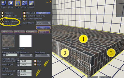
You can fix this by going into Edit mode, clicking the “Select Texture” radio button and customizing your sides. (Extra note: by holding down the shift key, you can select multiple textures sides at once). For Side 1, we have repeated the texture 2 x 1 (once on the short side, twice lengthwise). Essentially we are repeating the texture once every meter. Since our thin sides are only 0.2 meters thick, we need to “repeat” our texture on that side one-fifth as much, or 0.2. The texture on that side would thus be repeated 2x horizontally and 0.2x vertically.

When working with textures like a brick or stone block wall, you will also want to play with rotation (for example, side 1 and side 2 are rotated perpendicular from each other -- one is set to zero rotation, and one to 90 degree rotation). Also experiment with “flipping” your texture and offsetting how the texture is positioned on the prim side. Understanding these tools will help you properly align textures on multiple prims, and textures on the various sides of one prim.

If I going to use a prim more than once, I will create a master prim and get the textures positioned and repeated properly. Only then do I copy the prim.

Lighting
A little bit of lighting goes a long way. While you can’t create perfect shadows on every surface, with smart prim and texture work you can add a lot of ambiance. I constantly learn a huge amount about this just by watching Aimee Weber work (see picture).

One technique is to create a texture that will be repeated 1x1 on your prim, and “bake” the lighting/shading directly onto the image. For photoshop users who want to create a general light-cast on their image, one tool to get familiar with is Filter -> Render -> Lighting Effects. If you know how your shadow-casting objects are going to be positioned and the position of your light-source, you can also hand-draw shadows (make sure they are appropriately semi-transparent and blurry). Another technique is to take a picture of just the object itself and use that image (with the background removed) to create a shadow layer on top of your base texture. This may require playing with transparency, hue/saturation, blurriness, and rotation/skew in order to get the right feel. There are also 3D software tools that can make this easier.

If you don’t want to bake a single texture, you can place the shadow on its own prim. The tree shadows I give away for free are an example of this. It has to sit on its own prim because I have it rotate slightly to mimic movement of a tree in wind. I don’t want the ground underneath rotating as well – just the shadow!

Asymmetrical Textures
I recently learned some new things about how the SL engine handles textures, which is especially useful if you are working with an image whose dimensions do not naturally fit into a power of 2 (i.e. 2, 4, 8… 256, 512, etc). Rather than rehashing it here, I want to draw people’s attention to Chosen Few’s answer in this forum post. I’d also like to take this opportunity to thank Chosen for investing so much time and energy into helping new players learn about textures and building within SL.
That requisite first post

Oy, what to say here—a lot!

This interface is unfamiliar to me (with the exception of an experimental venture into Blogger long ago). So it's uncomfortable in some respects, but on the other hand, I'm challenged to adapt. I'm looking over how the SLog was set up by Forseti after he assembled us as a team to join—sounds like a comic book, n'est-ce-pas?—and it's freakin' weird (but not unpleasant) to see the "gutter" on the righthand side.

After looking at my neon watermelon blog for so long, the earthy tones are aptly like the ground from which the fruits grew from. It reminds me of some German microhaus sites are designed too. I believe that content presented with style helps the reader digest info more readily. I hope this will be true here.

To my knowledge, there hasn't been a sustained SL group blog up to the present. Second Language is on hiatus. :( There are some pleasant pickings (like fruit from the tree) like newspapers—Metaverse Messenger readily comes to mind—but presented in this freewheelin' context, I think we've got something unique going on! How it'll hold over in the longterm, we'll see.

You see, I know many Residents who've started blogs but grew bored with them, or just didn't have time, and ultimately, they were "frozen" for one reason or another. To me, that's a very dangerous thing because stagnation erodes, corrupts (literally), tears away at excitement. The oncenew teddy bear does not become a treasured old toy, but maybe its eyes popped out and it ain't getting the sewing it needs, and the stuffing is coming out of the... ahhh anyway let's move on.

I know a long dash might have been more appropriate than an ellipsis in that last sentence. That points to something: selfawareness. Recalling our experiences here as seen through our eyes, and then, doing more than bouncing ideas off of each other. A popular buzzword I've heard of in the business word is "synergy". I wonder about many things: we could be a pretty entertaining morning TV crew, huh?

Speaking of multimedia, in the Final Fantasy video game series, having a party—a group of adventuring explorers, often a very diverse group with a unified aim—is central to the storyline. Character dynamics also have the spotline shined on them. In Final Fantasy VII, balls which enable magic are called materia. They, like people, come in different colors.

There are a lot of flavors here, so a lot of magic. Stories to be told, tales to be weaved, songs to be sung of honorable actions! All of us SLog contributors participate in the SL Forums, which is candidly far from the most acerbic Internet forums I've come across, but still perceived to be too bitter for many I've come across. I'm hoping we can help more new Residents and those simply fresh to the Forums realize the worth in them, the gold—or materia, for that matter—that can be mined. Sources of knowledge, an accountable history leading back and then slingshotting forward into Second Life's future.

It's good to be here. :)

Monday, September 19, 2005

Enter the SLog


A first post, a little post, a YAYZERAMA post.

I may need to call the CDC down on Torley for invading my vocabulary -- Tor's enthusiasm is always so infectious. Enthusiasm. The members of this blog have different interests and perspectives, and we will probably write about all sorts of things, but a common thread is our fascination and joy with Linden Lab's Second Life.

When I joined in 2004, I told my wife that it would probably be a passing fad. She constantly reminds me of that statement when, almost a year later, I still spend excessive time in-world or on the forums. I ask, how do you avert your eyes from the formation of a new galaxy? The economic, sociological, psychological, political, and artistic issues are simply captivating. The creative possibilities are heady stuff. And the people -- bright, funny, creative people from all over the globe -- are the unifying fabric that make it truly fun. Humans, after all, are social creatures. We are a mix of all that is good and bad, noble and base in humanity. We are a microcosm of our species, the lucky pioneers, holding in our hands a new form of freedom.

Don't worry, not all of my posts will be so gushy, but I thought I would share the fact that, yes, I love it, frustrations and all. I think I can safely say that all of us here at SLOG love it!